Posts

Final Portfolio

Image
I can't believe my last semester at UT has finished. This class has taught me many valuable skills I will take with me in the future and this portfolio is here to prove that. I am so lucky to be able to have this opportunity despite the outbreak of the pandemic. I believe I did my best and learned a lot from this class whether it was in person or remotely. Thank you Professor Roundtree for all your help. 

Business Cards

Image
These are my business cards. They took about 2 hours to complete. I chose to stick with the film aspect of my logo and made the first business card based on a clapboard that you would see on set of a film or TV show, the next I chose to base it off of a marquee at a movie theatre that would tell you what movie is showing. The last business card was inspired by an old fashioned black and white film, I made my logo the projection for the movie. I liked making my logo into a business card because it allowed me to use my creativity and add my love of film into my business cards. Indesign took me a minute to get used to but I like how compatible it is with other Adobe products. My favorite business card I made is probably the clap board because it actually resembles one and puts my information where it would be if I was the director of a film. Below are my original sketches:

Somewhere Project

Image
For this project I struggled to come up with a photo I wanted to place myself into because a lot of my clothes are still back in Tampa. I began to think about different movies and artists I liked and being a huge fan of One Direction since middle school really swayed me to pick this album cover as my topic for this project. I began by choosing which member I wanted to remove and decided to remove Liam because he is super problematic now a days. I removed him by using the clone tool, I then took a couple of photos because I wanted to have options on which one to use. I then transformed all my photos into black and white and used the quick selection tool to remove myself from my first photo and insert myself into the album cover. It took me a while to remember how to place myself behind an object, but once I did figured that out it was easier for me to complete.  Hours to complete: 2 1/2 hours Below is the original album cover:

Somewhere project inspiration

Image
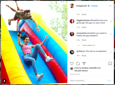
this is the first photo that caught my eye on Kirby Jenners instagram that made me feel like it would be very hard to photoshop myself into it because there is a lot of motion in the photo.  this next account sparked an idea in my head to photoshop myself with an artist or band but I didn't know which one.  as someone who is shorter than (almost) everyone in my family this made me laugh because of how accurately represented I felt when looking at it.  I would like to recreate this illusion because it look so realistic, I think this is something instagram influencers take advantage of because a lot of what they do looks so realistic but is highly edited and strategically placed. 

Autoscopy Project

Image
For my Autoscopy project I focused on how I miss being able to go outside and interact with people and just exist in nature because of COVID-19. Being stuck inside I feel like I get cabin fever and it makes me go insane. I am lucky I am able to go out onto my back porch and get fresh air but I wish I could go to the beach or to the woods and explore. I included two photos, the first being me made up of trees and leaves, the second showing a flower behind my face. I included both photos to make it as though I am wearing a mask and behind that mask is a flower, showing the real me.  I chose an orange flower because I feel like I am rooted outdoors and I get all my energy from being outside in the sun. I wanted it to seem as though I am made up of nature and if I look deep within myself I am a flower, constantly in bloom. I chose to use the trees because I feel as though I was uprooted and taken out of my place of comfort because of this virus, everything feels out of place but I con

black and white to color

Image
For this project we had to take a photo from black and white and add new colors into the image from an already existing color palette. I chose to pick a photo from last spring break because it reminds me of when we weren't stuck inside. The first photo I altered was the one titled square, I chose square because the color captured my eye and reminded me of summer. This was chosen after I decided that I wanted some yellow in each of my photos. I chose these color palettes because they all differ but have the yellow bringing them together. This project troubled me a little because I had issues outlining everything to add the colors but once I finished the first one it was a breeze to complete. This ended up taking me about 2 hours total and then another 10 to add the tag to it. Below you will find my 3 different versions with my favorite being the square version.  here is the original photo: 

Tag Brush

Image
This assignments objective was to take our black and white logo from adobe illustrator and create a "tag" similar to a graffiti tag you'd see on the street. This assignment felt a little confusing to me at first because of the instructions, I'm more of a hands on and visual learner that reading instructions just ends up frustrating me. Ever since classes went online due to Covid-19 I've been struggling to get assignments done because they feel optional now that I don't actually have to show up to campus. I chose the colors red, orange and yellow for my tag brush assignment because I normally have a very bright outlook on things but the virus outbreak has made it hard for me to remain positive, I put the red on top of the brighter colors because it is representative of how upset I am that there will not be a commencement ceremony in May, and I know that may sound like a first world problem because people are literally dying but I can't help but feel l